- Published on
Value vs Effort Matrix For SaaS Teams
- Authors

- Name
- Gabriel P.
- @gabriel__xyz
Value vs Effort Matrix For SaaS Teams
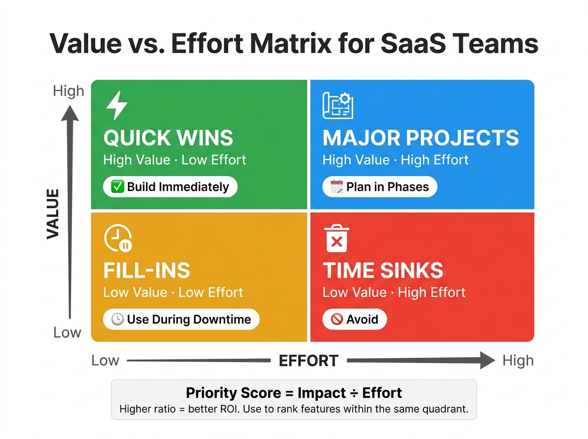
The Value vs. Effort Matrix is a simple, visual framework that helps SaaS teams prioritize features effectively. It evaluates feature ideas based on two factors: value (impact on users or business) and effort (resources required to implement). Features are categorized into four quadrants:
- Quick Wins: High value, low effort. Prioritize these immediately.
- Major Projects: High value, high effort. Plan carefully in phases.
- Fill-Ins: Low value, low effort. Handle during downtime or slower periods.
- Time Sinks: Low value, high effort. Avoid these to save resources.
This approach prevents teams from wasting time on unimportant tasks and ensures alignment with business goals. By defining clear criteria for value (e.g., revenue potential, user demand) and effort (e.g., development, testing), teams can make data-driven decisions. Involving cross-functional teams and regularly updating the matrix ensures it stays relevant and actionable.
Key Takeaways:
- Focus on Quick Wins to deliver fast results.
- Use data like customer feedback, support trends, and revenue impact to score features.
- Regularly review and update the matrix for shifting priorities.
- Avoid Time Sinks to protect team resources.
The matrix is a practical tool for SaaS teams to prioritize features, streamline roadmaps, and make confident decisions.
The Value VS Effort Model - Definition and How To Use It
Key Components of the Matrix
The effectiveness of a 2x2 matrix hinges on how well each axis - value and effort - is defined. Without clarity, prioritization can quickly go off track. To make this tool work, you’ll need precise definitions for both dimensions before diving into scoring. Once those are set, the next step is to quantify the value of each feature.
How SaaS Teams Define 'Value'
In the SaaS world, value is a combined score based on several factors: how well a feature solves a real user pain point, its potential to increase revenue, its impact on retention or activation, and whether it aligns with your product strategy.
The best way to anchor these scores is with actual data. For example, look at cumulative MRR (Monthly Recurring Revenue) from customers requesting a specific feature. Other helpful data points include:
- Feedback board votes
- Support ticket trends
- Churn reasons
Remember, not all feedback is created equal. A feature requested by 50 enterprise clients could be far more valuable than one requested by 300 free-tier users. Weighting features by customer segment ensures your scores reflect real business priorities.
"It is humbling to see how bad experts are at estimating the value of features (us included)." - Microsoft [2]
Strategic alignment also plays a key role. Even if a feature has high user demand, its value score might drop if it doesn’t fit your product’s long-term vision. Popularity alone isn’t enough - features need to align with where your product is headed.
Once you’ve nailed down value, the next step is estimating effort.
How to Estimate 'Effort'
Effort isn’t just about development time. It also includes UI/UX design, quality assurance, documentation, and ongoing support.
For early-stage roadmapping, many teams use T-shirt sizing (XS, S, M, L, XL) to avoid overly specific time estimates. As projects move into development, you can switch to more detailed metrics like story points or person-month estimates.
It’s crucial to involve your technical team in this process. They can uncover hidden complexities, such as third-party API dependencies or database migrations, that could turn a "medium" effort into a much larger one.
"The solution? Involve your engineering team in the scoring session. Let them assign effort scores while product assigns impact scores." - Features.Vote [1]
To keep things consistent, establish benchmark features that represent "high" and "low" effort. This helps everyone stay on the same page when scoring.
How to Use the Value vs. Effort Matrix
Once you've defined what "value" and "effort" mean for your team, you're ready to bring the matrix to life. The process itself is simple, but the details make all the difference.
Scoring and Plotting Features
Start by selecting 5–20 features from your backlog. This range is big enough to allow meaningful comparisons but small enough to keep the session manageable. For each feature, assign a value score and an effort score based on your chosen scale (e.g., 1–5, 1–10, or even T-shirt sizes). Then, plot each feature on a 2x2 grid - value on the vertical axis and effort on the horizontal axis.
Each feature will land in one of these quadrants:
| Quadrant | Characteristics | Recommended Action |
|---|---|---|
| Quick Wins | High Value, Low Effort | Build these right away |
| Major Projects | High Value, High Effort | Plan these in quarterly phases |
| Fill-Ins | Low Value, Low Effort | Use as stretch goals or onboarding tasks |
| Time Sinks | Low Value, High Effort | Avoid or eliminate |
To keep the session productive, limit discussions to five minutes per feature. Once plotted, this visual data becomes the foundation for deeper prioritization.
Prioritizing Based on Quadrants
The quadrants provide a helpful starting point, but they aren't the final word. To refine your rankings, use the formula Priority = Impact / Effort. Features with higher ratios offer a better return on investment. This formula is especially useful for ranking features within the same quadrant.
"Quick Wins always rank highest." - Features.Vote
Start with Quick Wins to deliver immediate results. For Major Projects, focus on one per quarter, breaking them into smaller, manageable phases to avoid overloading your team. Fill-Ins are great for slower periods or onboarding tasks, while Time Sinks should be firmly rejected - clearly communicating this decision to stakeholders is key.
Refining your initial scores with actual feedback will make your prioritization even sharper.
Using Feedback Data to Inform Scoring
Relying on gut feelings for scoring can lead to inaccuracies. A better approach is to anchor your value scores in tangible metrics, like cumulative MRR (monthly recurring revenue) from customers requesting a specific feature. Supplement this with data like vote counts, support tickets, and churn rates for a well-rounded view.
Tools like Features.Vote simplify this process by consolidating user feedback into a centralized voting board. You can filter the data by customer segments, ensuring that a vote from a $10,000/year enterprise account carries more weight than one from a free-tier user. This segmentation ensures your value scores align with your business goals, keeping decisions objective and grounded in the matrix's purpose.
"The matrix surfaces trade-offs often missed in individual evaluations." - Quackback
Common Mistakes and How to Avoid Them
Now that you've got a solid understanding of value and effort, it's time to address some common missteps that can derail your prioritization process. Teams often fall into predictable traps, but being aware of these pitfalls makes them much easier to sidestep. Below, we’ll walk through some of the most frequent mistakes and practical ways to steer clear of them.
Vague or Inconsistent Scoring
If your scoring process lacks clarity, it’s easy for different factors - like potential revenue versus internal chatter - to skew the results. To keep things consistent, establish clear criteria and require supporting evidence for your scores. For example, use metrics like vote counts, the volume of support tickets, or the number of enterprise accounts requesting a feature. This ensures decisions aren’t based on gut feelings or personal biases.
"Without a clear scoring process, prioritization can skew toward subjective opinions or a single influential viewpoint." - Features.Vote [1]
Also, don’t forget how static scores can lead to outdated or irrelevant planning.
Treating Scores as Fixed
Scores aren’t set in stone. Market conditions, internal priorities, and external factors can shift quickly. For instance, a competitor’s new feature launch might make an overlooked item on your list suddenly urgent. Or, an infrastructure update could reduce the effort required for a project. To stay adaptable, review and update scores during each planning cycle or when significant new data arises. However, avoid weekly re-scoring - it adds unnecessary overhead and reduces the framework’s effectiveness.
"The matrix is most useful as a stable reference point within a planning horizon, not as a real-time dashboard." - James Morton, Founder, Quackback [3]
Another area that needs attention? Properly segmenting customer feedback.
Ignoring Customer Segmentation
Not all customer feedback carries the same weight, and treating it equally can throw your matrix off balance. This can lead to a roadmap that prioritizes the loudest voices rather than the most impactful needs. To fix this, adjust value scores based on customer revenue impact. Tools like Features.Vote can help you filter feedback by customer segment, ensuring your decisions align with your business objectives instead of just amplifying the most vocal users' opinions.
Best Practices for SaaS Teams
To make a feature prioritization matrix a dependable tool for SaaS teams, sticking to disciplined practices is key. These approaches help maintain the matrix as a reliable guide for strategic decisions, ensuring it remains relevant and effective.
Set Clear, Consistent Scoring Criteria
Ambiguity is the fastest way to undermine your scoring system. If "High Value" means different things to different team members, the matrix loses its reliability. To avoid this, define what each score level represents before anyone starts evaluating features.
Use a 1–5 scoring scale with specific anchors for metrics like user impact, revenue potential, and signal strength. When scoring effort, account for all aspects - design, quality assurance, testing, documentation, and rollout coordination. For example, a feature that takes two days to build but requires three weeks for testing and documentation isn’t truly "Low Effort." Consider using relative sizing methods, like T-shirt sizes or Fibonacci story points, to highlight significant differences. This approach ensures roadmap decisions are based on consistent, comparable data rather than subjective opinions.
Run Regular Cross-Functional Reviews
No single team member has the full picture. Engineering can identify technical constraints, Sales and Customer Success offer insights into churn drivers, and Design might flag hidden complexities in user experience. Bringing these perspectives together ensures scores are as objective as possible.
Take Spotify as an example. Initially, the "Discover Weekly" feature was classified as a high-effort "Big Bet" requiring new AI. However, during a cross-functional review, engineers realized they could leverage existing listening data and tools. This insight allowed the feature to launch in weeks instead of months, and it now serves 40% of their user base weekly.
Keep review sessions efficient by limiting participants to 5–8 people, scoring features independently, and capping sessions at 90 minutes for 10–15 features. Tools like Features.Vote can integrate real user data - such as vote counts and segmented feedback - into the scoring process, grounding decisions in evidence rather than opinions. Regular reviews also ensure the matrix stays relevant as priorities shift.
Update the Matrix on a Regular Schedule
To keep your matrix aligned with current priorities, re-evaluate scores at the start of every planning cycle (typically every 2–4 weeks) or at least quarterly. Establish triggers for unscheduled updates, such as a competitor launching a major feature, a significant infrastructure change reducing effort estimates, or a surge in user feedback. Document the reasoning behind each score (e.g., "requested by 6 enterprise accounts" or "tied to Q3 expansion goal") so future reviewers understand both the numbers and their context. Regular updates ensure the matrix remains a valuable tool for driving clarity and efficiency in decision-making over time.
Conclusion
The value vs. effort matrix gives SaaS teams a clear, visual way to manage their backlog and make smarter decisions more efficiently. Instead of leaning on anecdotal opinions, this framework allows teams to assess features through two straightforward dimensions, enabling confident and informed decisions.
The matrix's four quadrants - Quick Wins, Major Projects, Fill-Ins, and Time Sinks - help clarify the next steps for every feature. These quadrants guide whether to prioritize, plan, defer, or skip features altogether. Saying no to Time Sinks, in particular, safeguards your team's most precious asset: time.
However, the matrix is only as effective as the data supporting it. Relying too much on gut feelings can lead to bias creeping into decisions. To maintain objectivity, it’s essential to anchor the "Value" axis in measurable data like vote counts, support ticket trends, or cumulative MRR. Tools like Features.Vote simplify this process by providing ranked user demand data, ensuring that impact scores reflect actual customer needs rather than assumptions. With flexible plans available for teams of all sizes, it’s a practical tool for integrating genuine user feedback into your prioritization process. This data-driven approach strengthens the matrix’s role in shaping strategic roadmaps.
Teams that benefit most from this framework treat it as a living document. By updating scores regularly and involving cross-functional teams, the matrix becomes a dependable tool for ongoing roadmap decisions. Over time, this approach turns the matrix into a cornerstone for continuous product development and improvement.
FAQs
::: faq
What’s the best way to score “value” without guessing?
The most reliable way to determine value is by using solid data points like customer feedback, vote counts, support tickets, or revenue impact. Steer clear of relying on instinct, and maintain fairness by sticking to a consistent scoring method for all features. :::
::: faq
How do we estimate 'effort' when requirements aren’t clear yet?
When dealing with unclear requirements, it's better to use relative sizing methods like T-shirt sizes (Small, Medium, Large) or story points rather than attempting precise estimates. Make sure to involve your development team in the process to validate these estimates and ensure you account for all aspects of the work - this includes design, QA, and deployment tasks.
If there's uncertainty, highlight it by providing ranges or indicating low confidence in the estimates. This helps to adjust expectations for any unknowns. Collaborating early with technical teams can also improve the accuracy of estimates and help minimize potential biases. :::
::: faq
How often should we update the matrix without overdoing it?
To keep your matrix in sync with your team's priorities, make it a habit to update it regularly. A solid approach is to review it at the end of each sprint or planning cycle, which usually spans 2-4 weeks. Alternatively, a quarterly review might work better for some teams. Others may prefer a 1-3 month schedule to factor in new data and insights. The key is to adjust the timing to match the speed of your product development and the specific needs of your team. :::